
Menu
Work
About
Contact
HAJI HNAIS RESTAURANT
Rooted in the South: A Mesopotamian Visual Identity
We crafted a deeply southern identity rooted in the ancient soul of Mesopotamia. Haji Hneis is not just an Iraqi restaurant—it’s a tribute to the southern Iraqi spirit. Owned by the Qahwaji Holding Group, one of Iraq’s leading names in the food and restaurant industry, Haji Hneis redefines local fine dining with a uniquely native aesthetic that blends heritage with luxury.
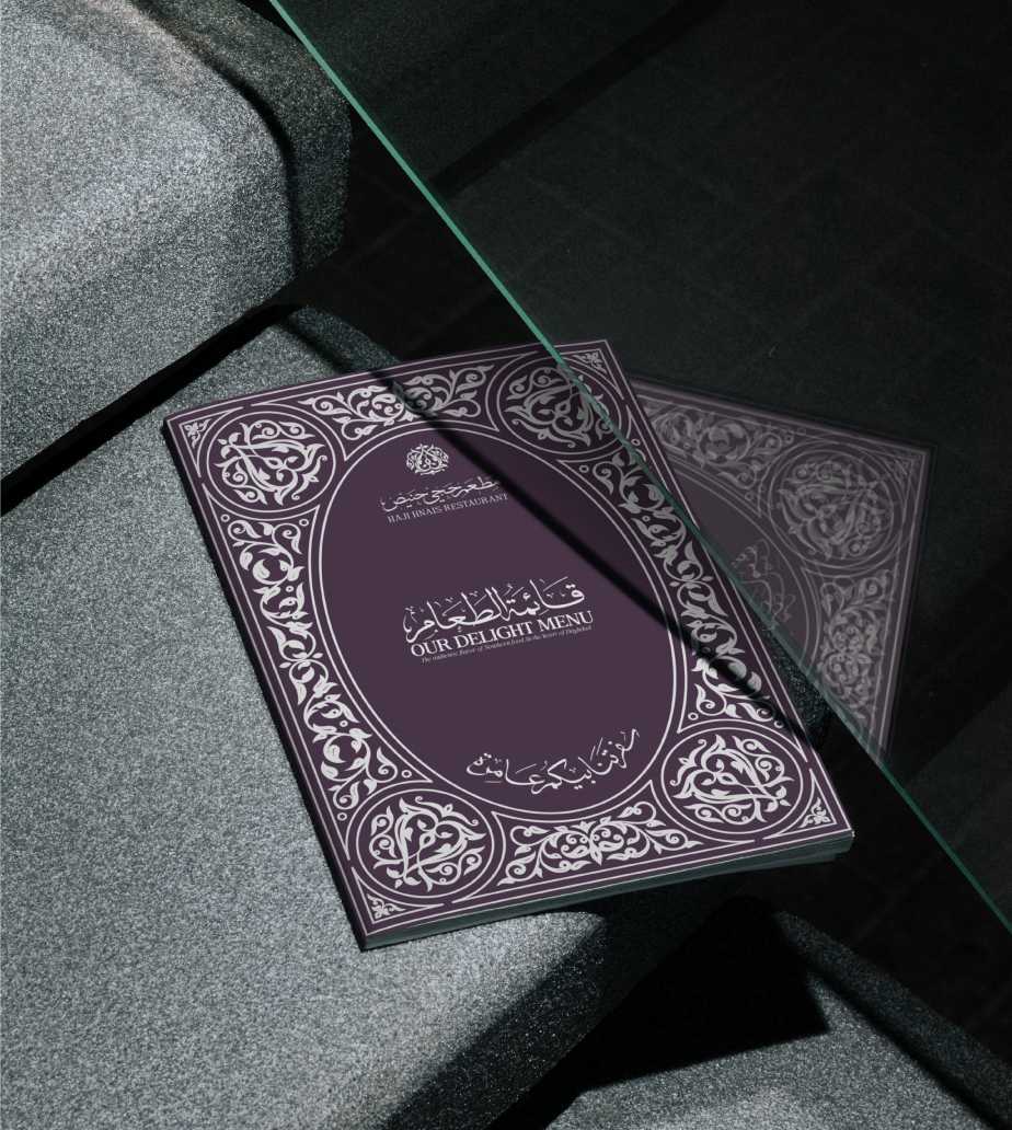
Digital Catalog & Typography
Branding
Website
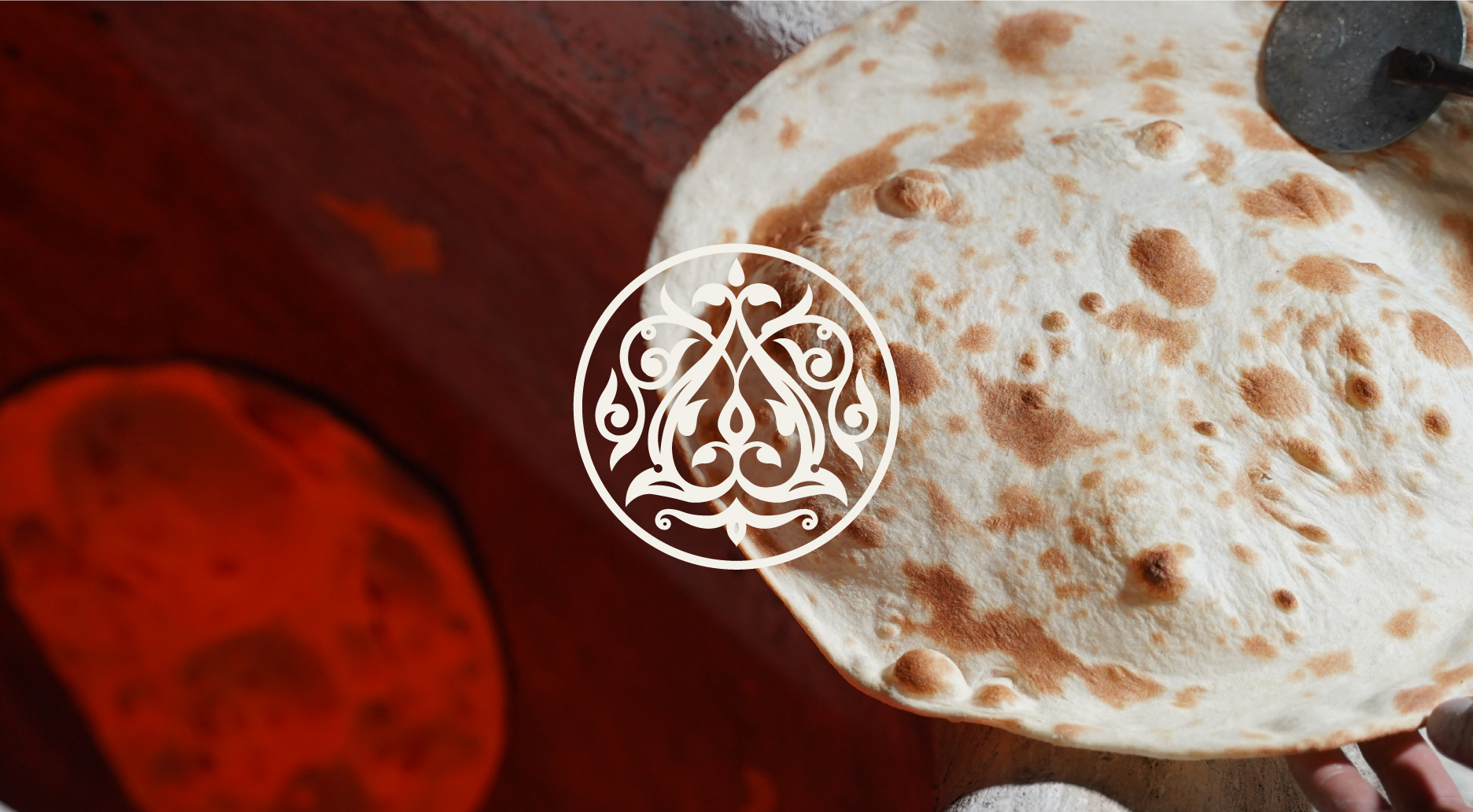
Logo
Art Direction
Beyond the Usual: Local Luxury Reimagined
The challenge was clear—how do we make a luxury restaurant feel truly Iraqi without falling into clichés? By stepping away from generic design trends and creating something visually exceptional, we honored the story of Haji Hneis himself, a man who lived during the Iraqi monarchy era and became a symbol of authenticity.
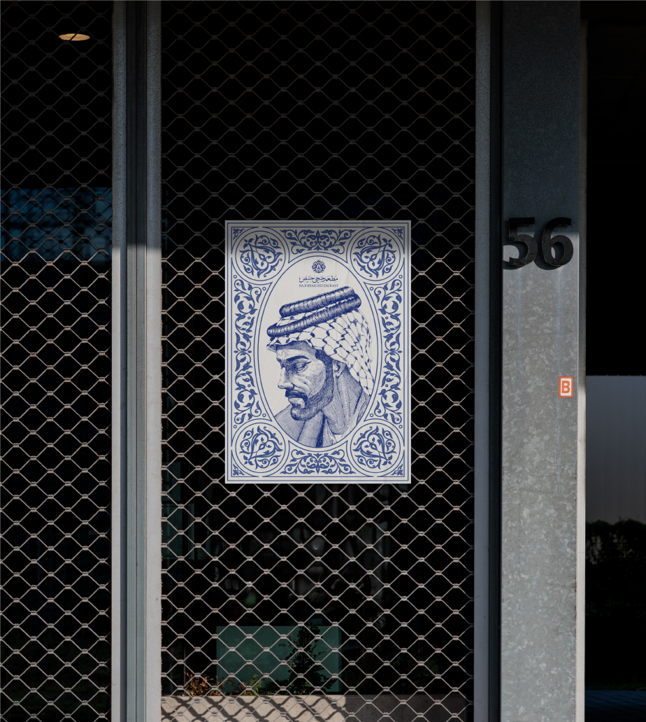
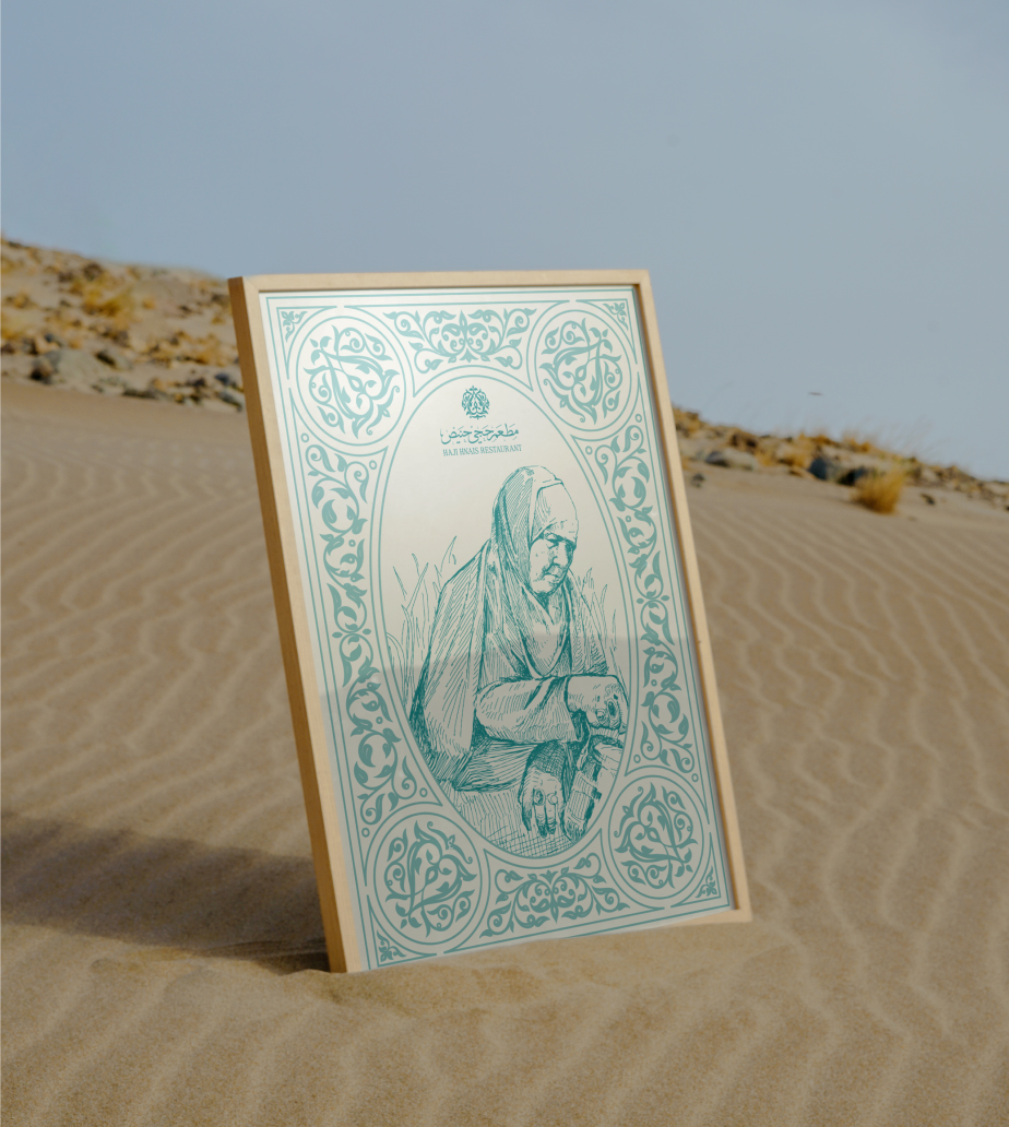
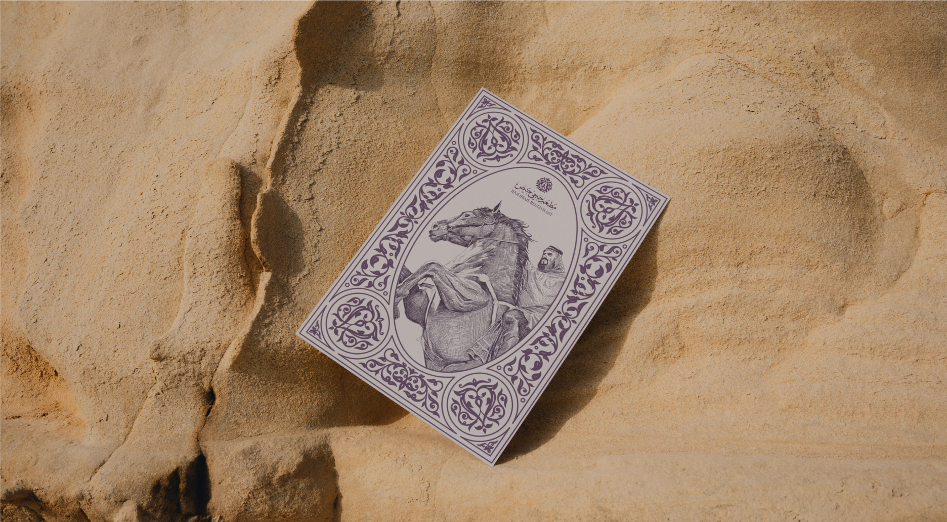
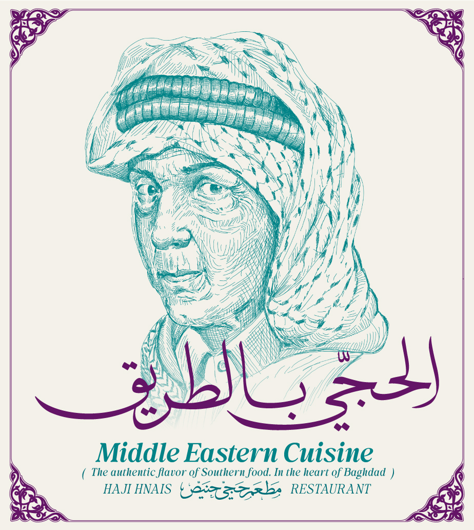
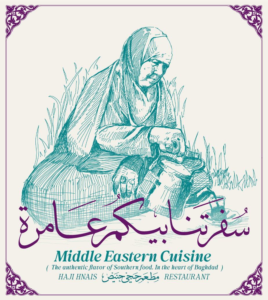
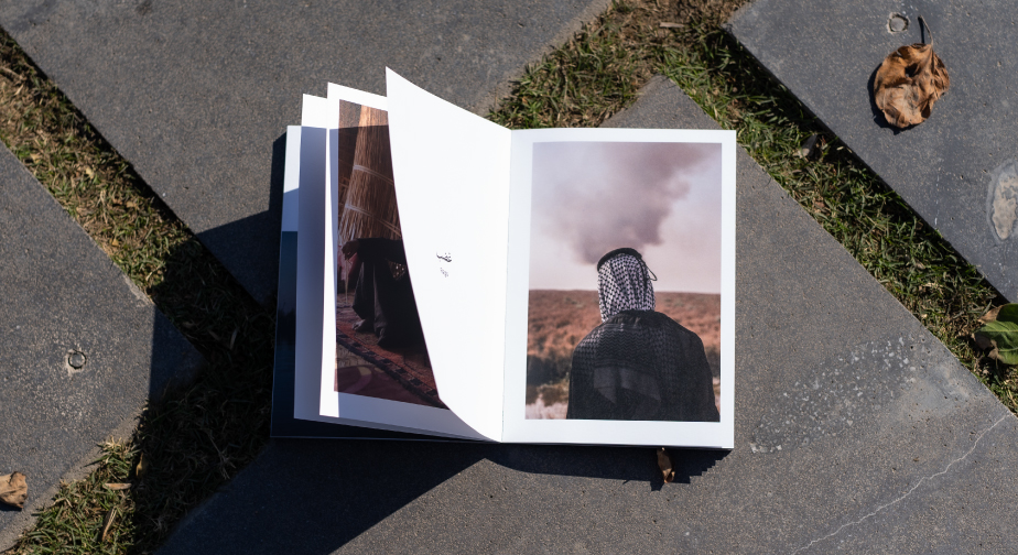
Drawn from the Land: Illustrations in Cross-Hatching
To echo the depth and texture of southern Iraqi life, we employed cross-hatching—a technique that embraces complexity and richness. These hand-drawn illustrations became key to building a layered, meaningful visual identity.
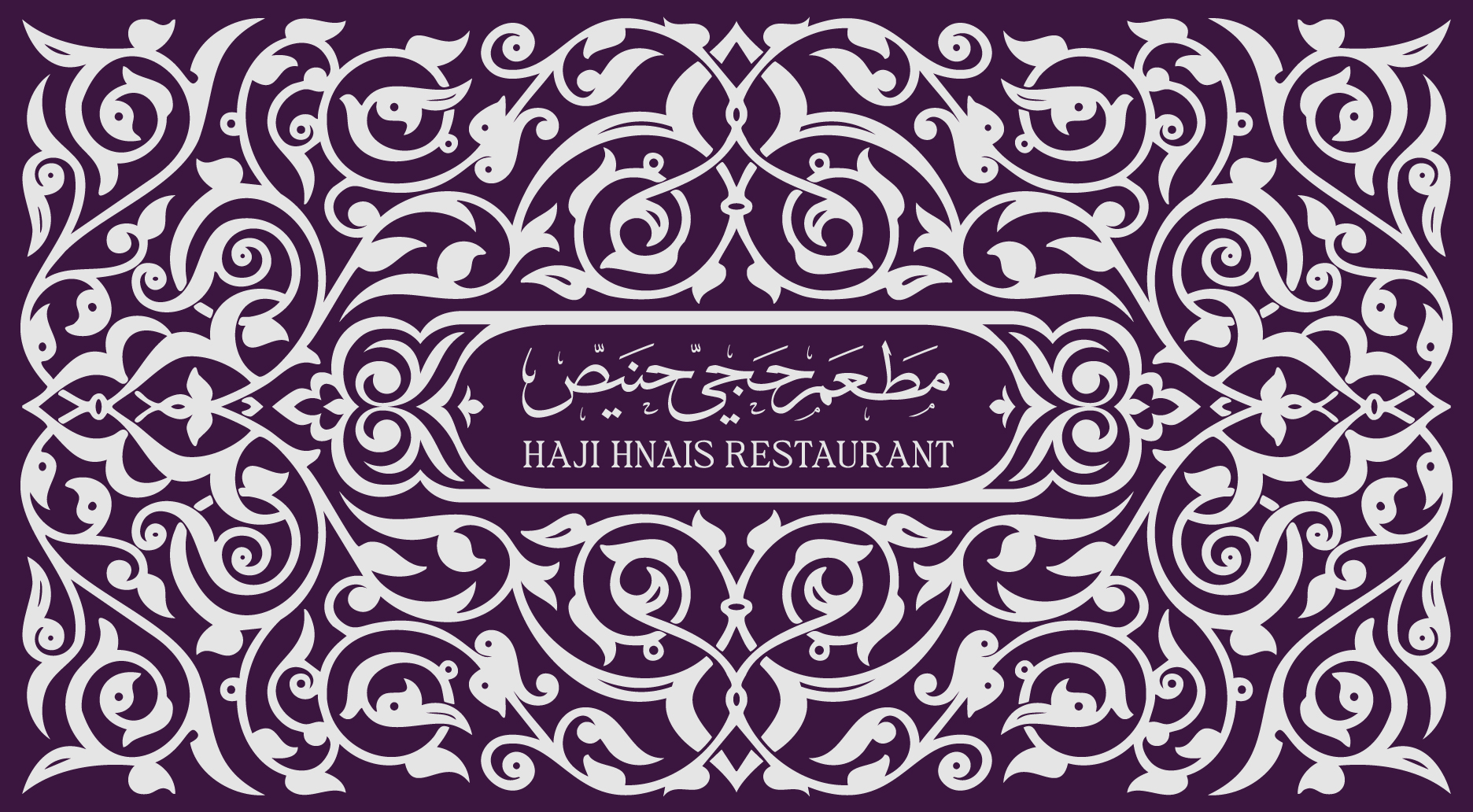
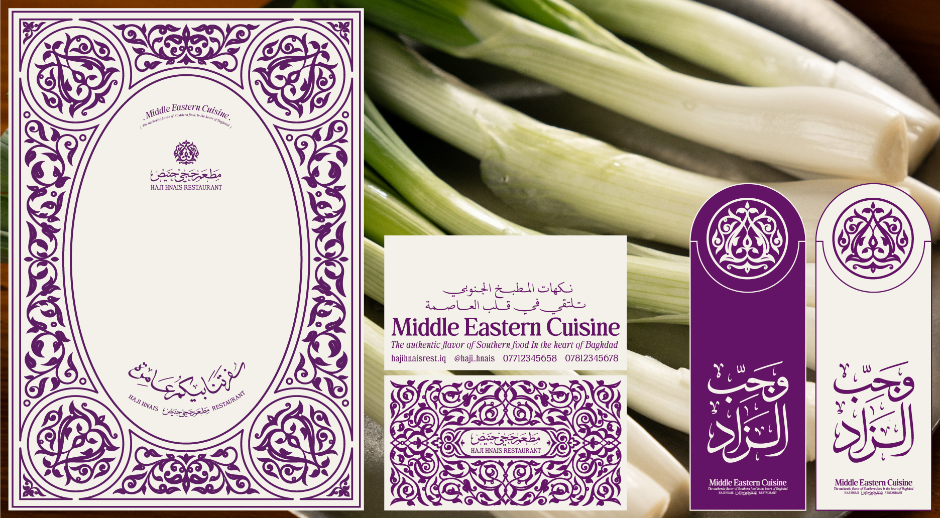
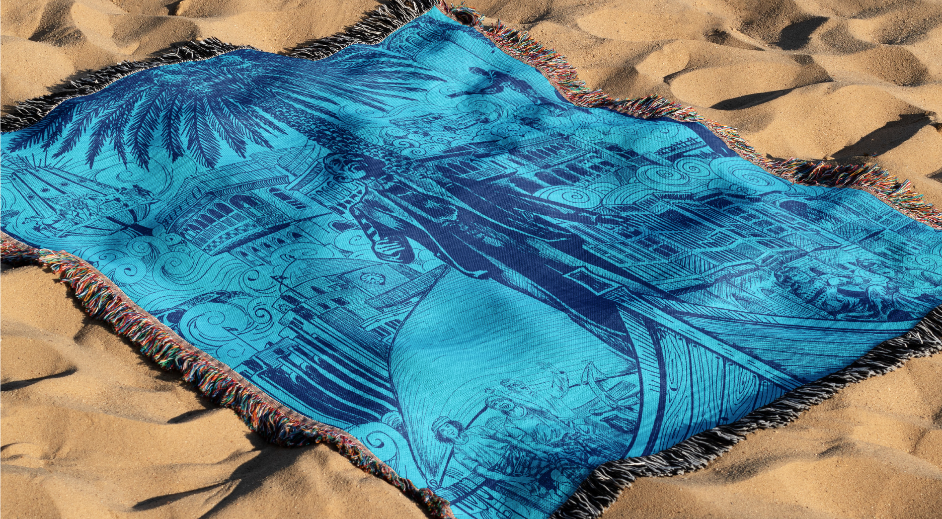
Timeless Motifs: Decorative Patterns of a Nation
For thousands of years, ornamental patterns have echoed through Iraq’s visual culture. We embedded these decorative elements deeply within Haji Hneis’s identity, crafting a mesmerizing visual language that’s both modern and historically resonant.
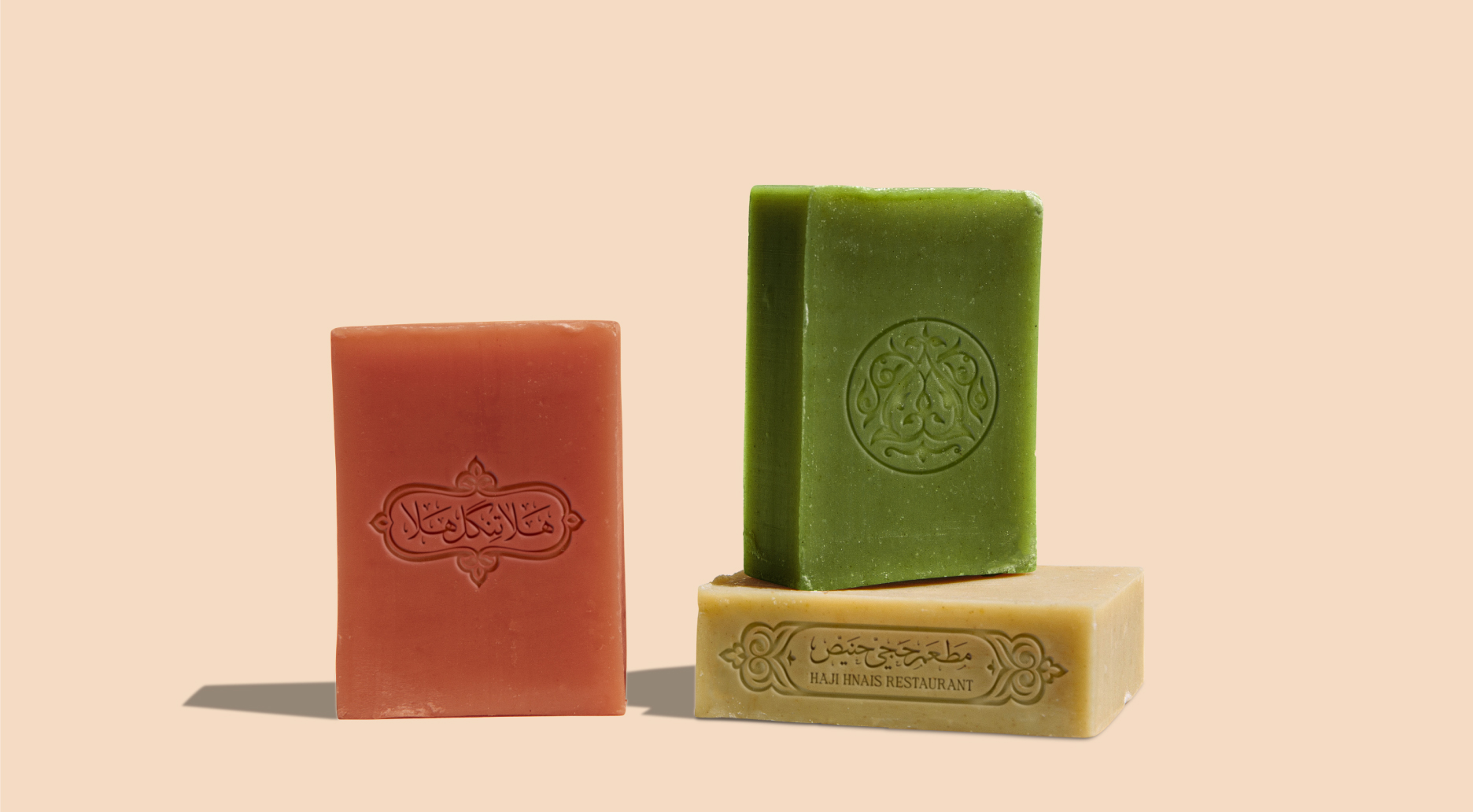
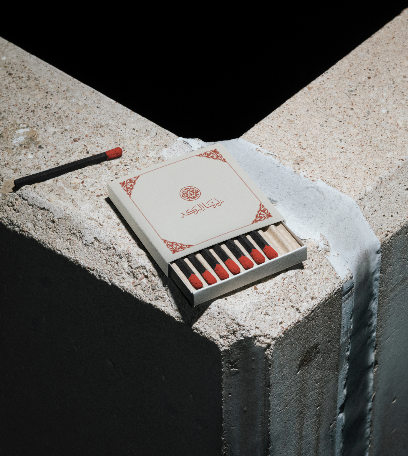
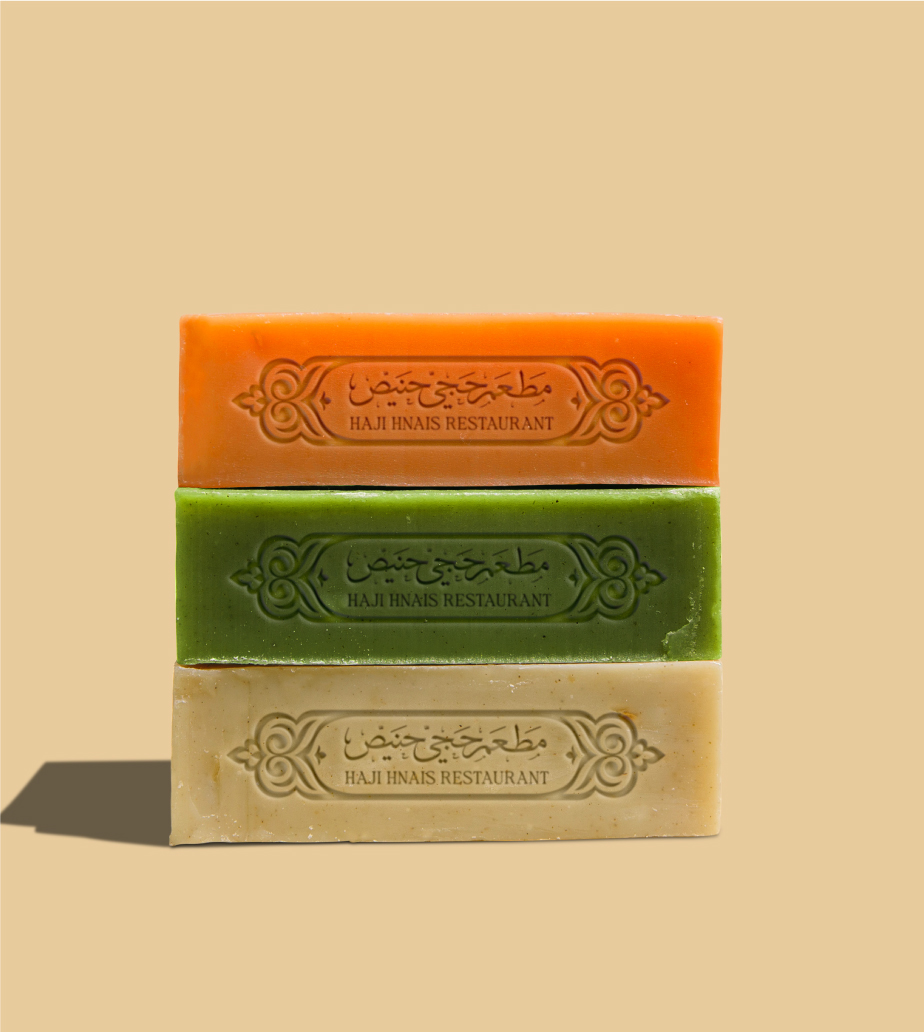
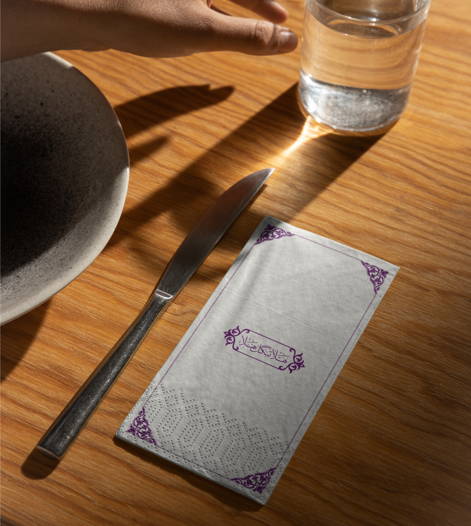
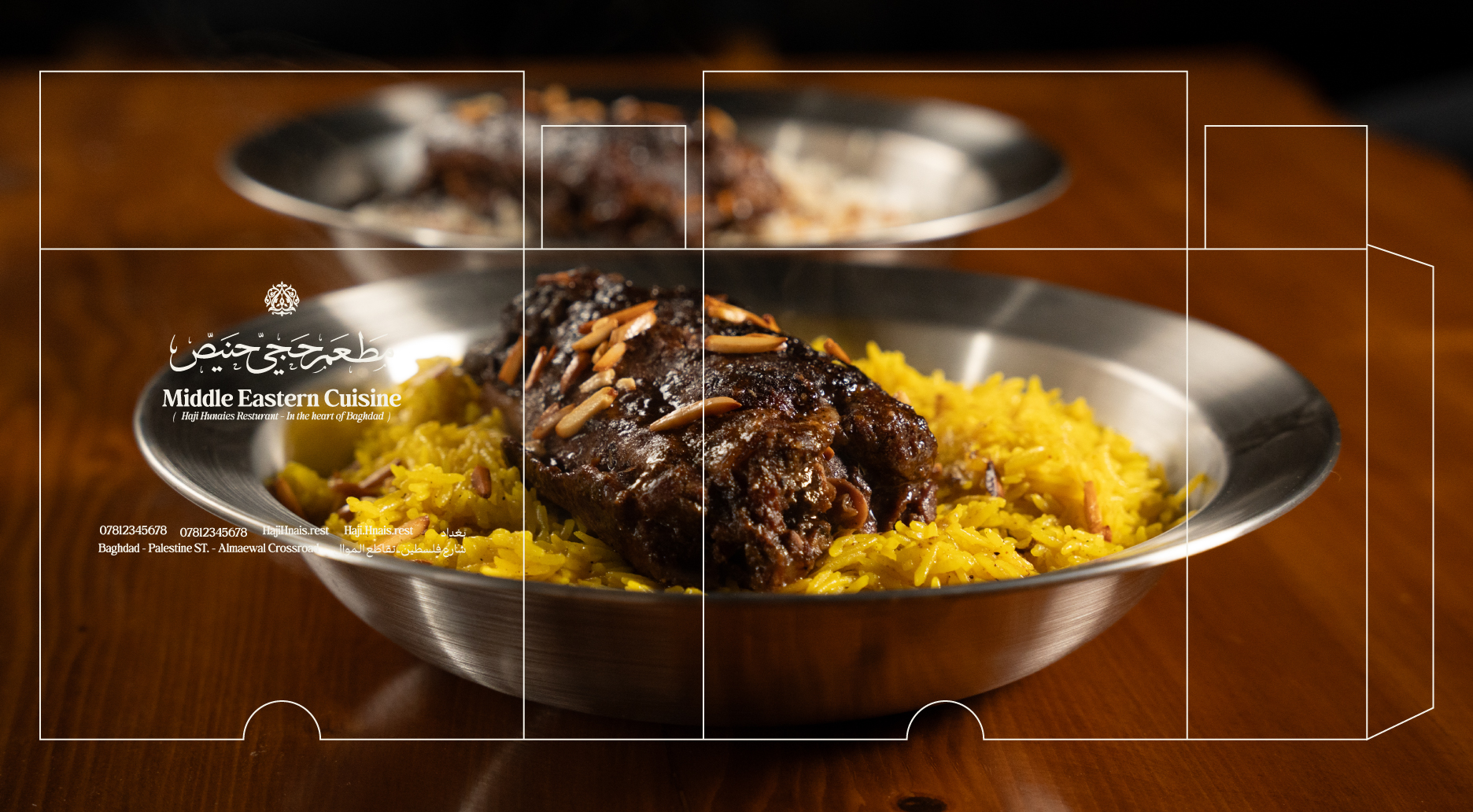
Design in Action: Cohesive Brand Applications
With every visual element finalized, the challenge turned to orchestration. From signage to menus, from packaging to uniforms—each application was a symphony of the brand’s core components. The packaging, in particular, became a foundational asset that embodied the entire identity.
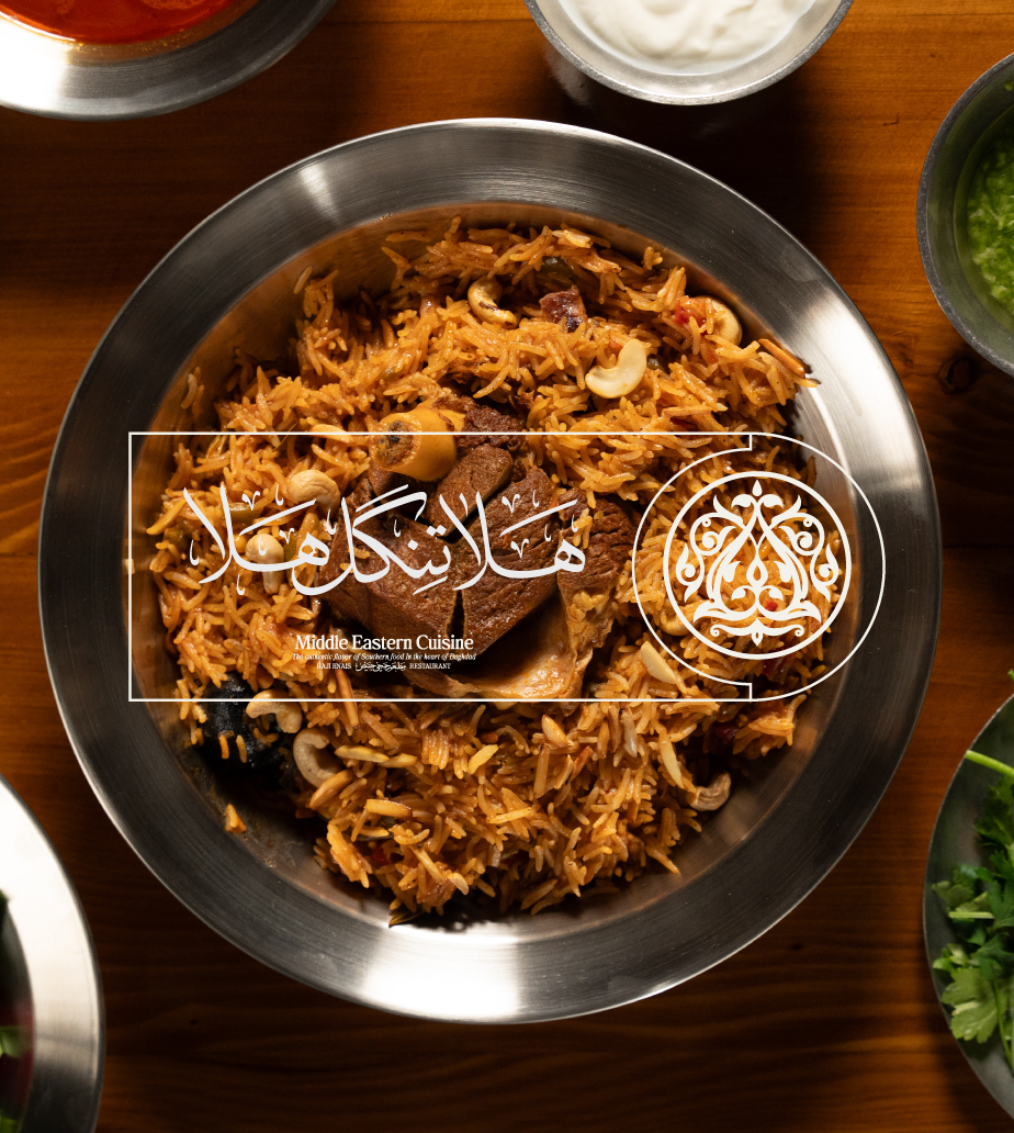
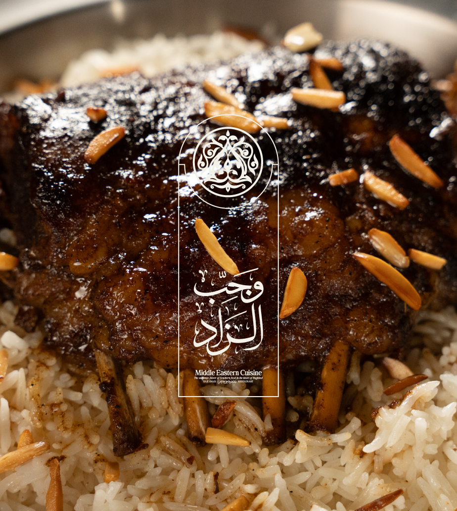
Flavor Captured: Food Photography as Storytelling
Southern flavors, global presentation. Our approach to food photography transformed humble dishes into luxurious experiences. Each frame was a moment frozen in time—guided by a visual manual we developed to ensure every pixel told the story of taste, heritage, and elegance.
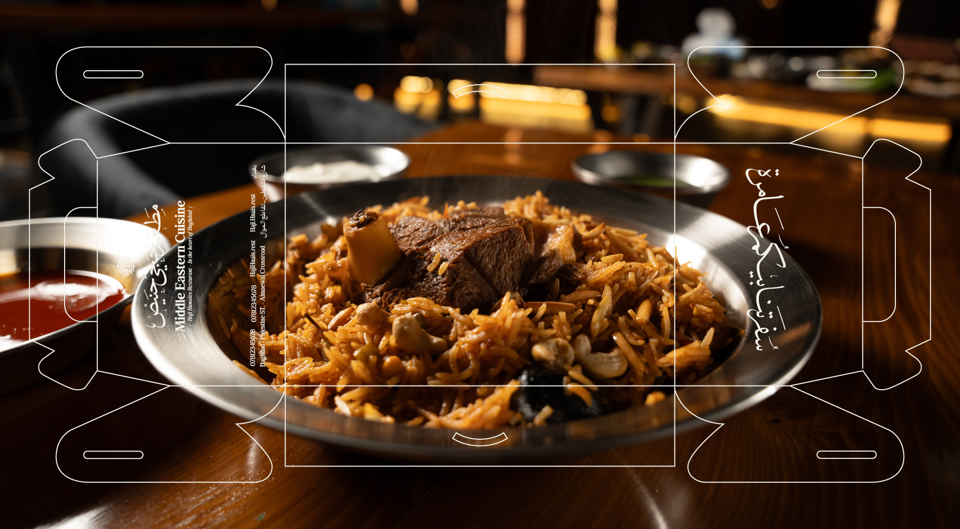
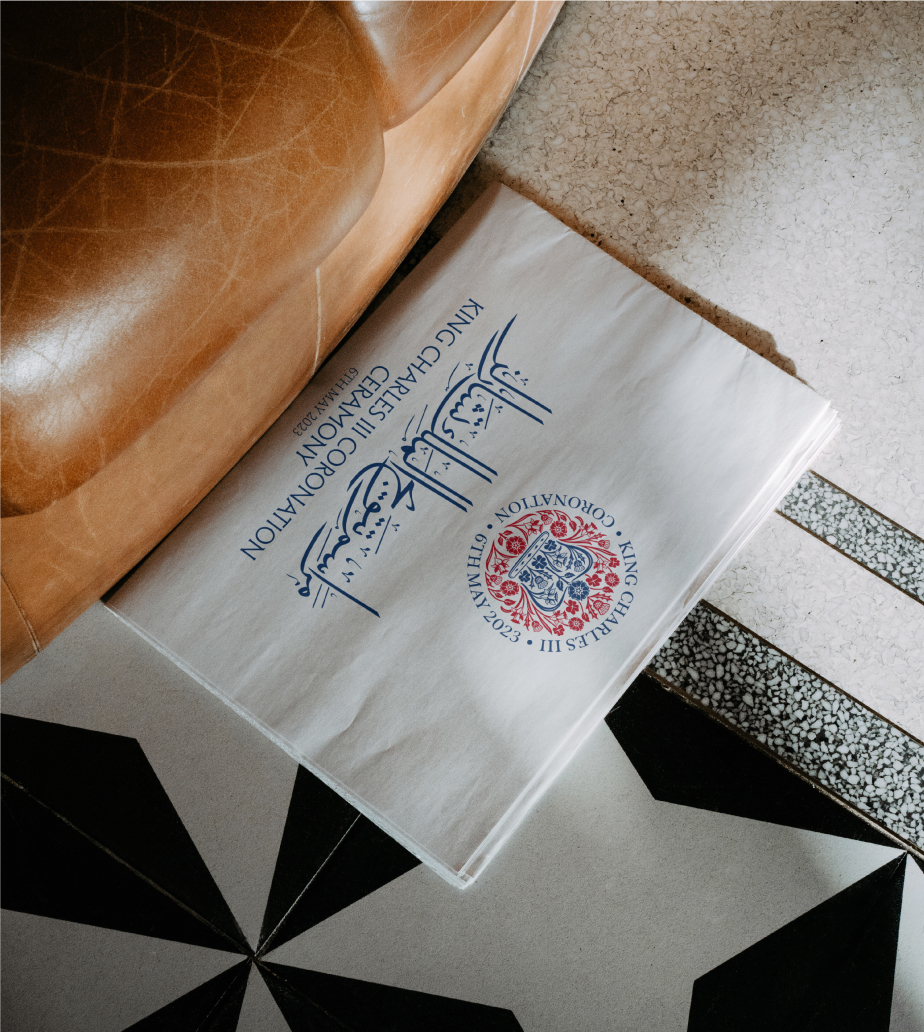
The Language of Form: Arabic Calligraphy as Identity
Calligraphy is not just an aesthetic—it’s a feeling. Its inclusion wasn’t optional; it was essential. Familiar to local audiences and rich in emotional value, Arabic script infused the brand with beauty, purpose, and cultural relevance.
Timeless Motifs: Decorative Patterns of a Nation
For thousands of years, ornamental patterns have echoed through Iraq’s visual culture. We embedded these decorative elements deeply within Haji Hneis’s identity, crafting a mesmerizing visual language that’s both modern and historically resonant.
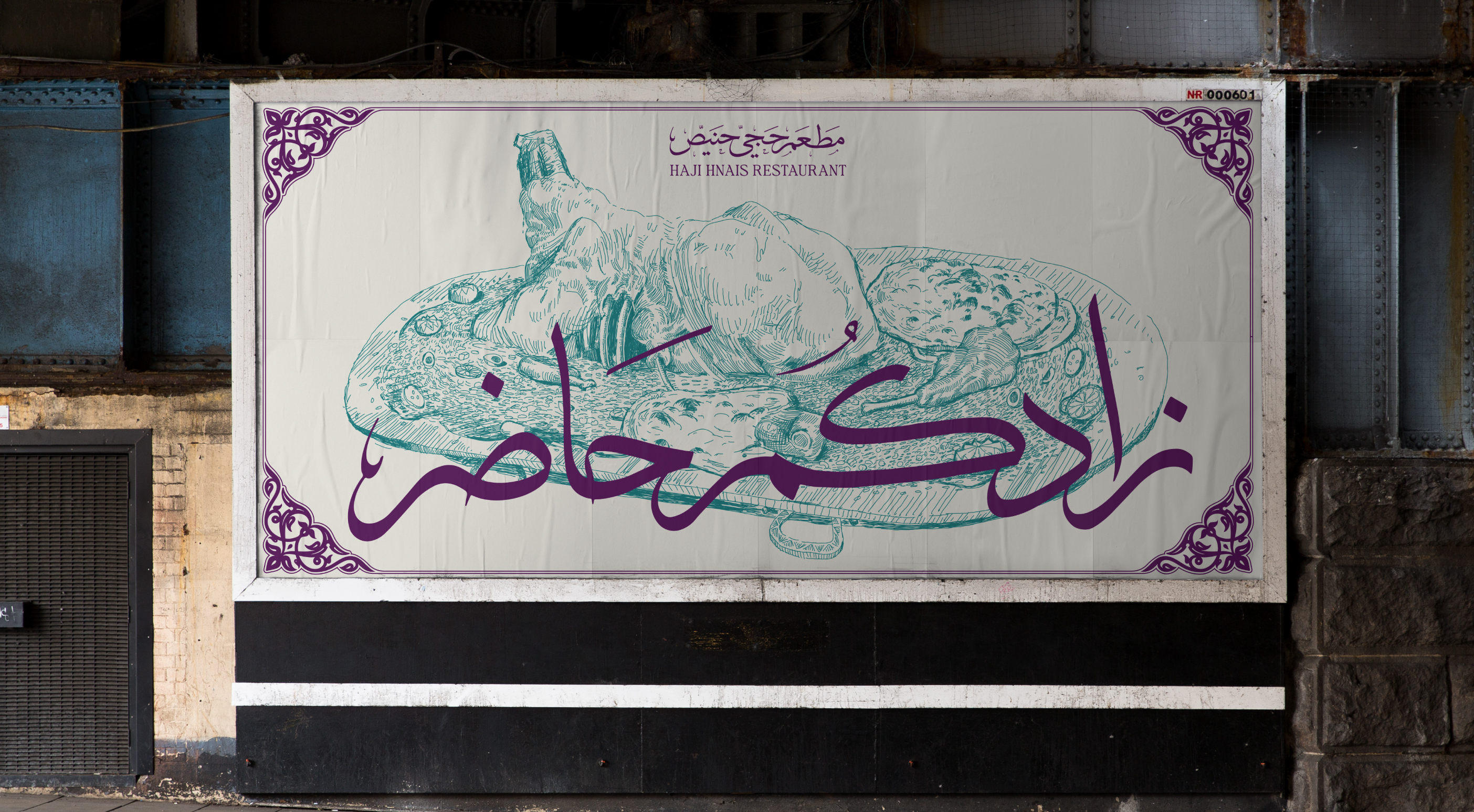
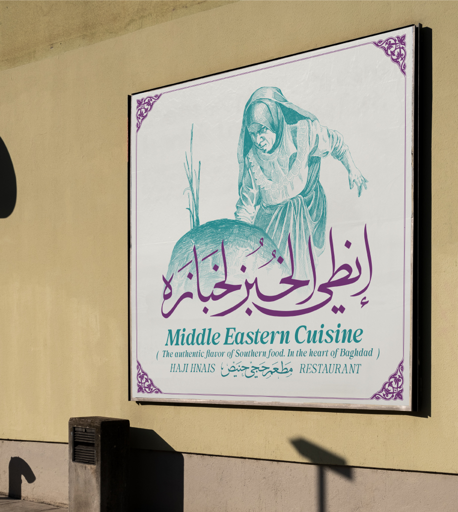
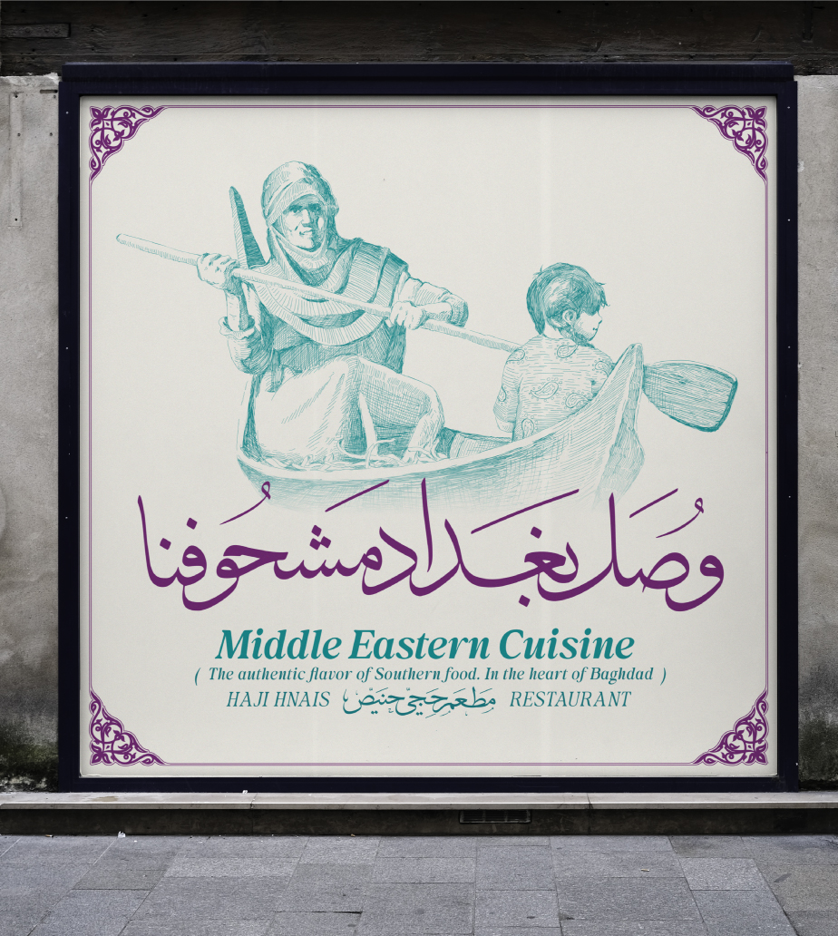
Taking It to the Streets: Outdoor Advertising with Character
From teaser campaigns across Baghdad to launch billboards, our outdoor visuals brought Haji Hneis to life. Inspired by the brand’s own illustrations and animated heritage, we paired each visual with southern Iraqi voice lines and slogans—making every banner a cultural statement.

Other Projects

Connect with us to explore your project's potential.


OFFICE
Karradah, Kharij Street, Baghdad, Iraq
CONTACT
+964 7717777 075
info@becorp.be
SOCIAL
ITS ABOUT IMPACT

Work
About
Contact
HAJI HNAIS RESTAURANT
Rooted in the South: A Mesopotamian Visual Identity
We crafted a deeply southern identity rooted in the ancient soul of Mesopotamia. Haji Hneis is not just an Iraqi restaurant—it’s a tribute to the southern Iraqi spirit. Owned by the Qahwaji Holding Group, one of Iraq’s leading names in the food and restaurant industry, Haji Hneis redefines local fine dining with a uniquely native aesthetic that blends heritage with luxury.
Digital Catalog & Typography
Branding
Website
Logo
Art Direction
Beyond the Usual: Local Luxury Reimagined
The challenge was clear—how do we make a luxury restaurant feel truly Iraqi without falling into clichés? By stepping away from generic design trends and creating something visually exceptional, we honored the story of Haji Hneis himself, a man who lived during the Iraqi monarchy era and became a symbol of authenticity.
Drawn from the Land: Illustrations in Cross-Hatching
To echo the depth and texture of southern Iraqi life, we employed cross-hatching—a technique that embraces complexity and richness. These hand-drawn illustrations became key to building a layered, meaningful visual identity.
Timeless Motifs: Decorative Patterns of a Nation
For thousands of years, ornamental patterns have echoed through Iraq’s visual culture. We embedded these decorative elements deeply within Haji Hneis’s identity, crafting a mesmerizing visual language that’s both modern and historically resonant.
Design in Action: Cohesive Brand Applications
With every visual element finalized, the challenge turned to orchestration. From signage to menus, from packaging to uniforms—each application was a symphony of the brand’s core components. The packaging, in particular, became a foundational asset that embodied the entire identity.
Flavor Captured: Food Photography as Storytelling
Southern flavors, global presentation. Our approach to food photography transformed humble dishes into luxurious experiences. Each frame was a moment frozen in time—guided by a visual manual we developed to ensure every pixel told the story of taste, heritage, and elegance.
The Language of Form: Arabic Calligraphy as Identity
Calligraphy is not just an aesthetic—it’s a feeling. Its inclusion wasn’t optional; it was essential. Familiar to local audiences and rich in emotional value, Arabic script infused the brand with beauty, purpose, and cultural relevance.
Timeless Motifs: Decorative Patterns of a Nation
For thousands of years, ornamental patterns have echoed through Iraq’s visual culture. We embedded these decorative elements deeply within Haji Hneis’s identity, crafting a mesmerizing visual language that’s both modern and historically resonant.
Taking It to the Streets: Outdoor Advertising with Character
From teaser campaigns across Baghdad to launch billboards, our outdoor visuals brought Haji Hneis to life. Inspired by the brand’s own illustrations and animated heritage, we paired each visual with southern Iraqi voice lines and slogans—making every banner a cultural statement.

Other Projects

Connect with us to explore your project's potential.


OFFICE
Karradah, Kharij Street, Baghdad, Iraq
CONTACT
+964 7717777 075
info@becorp.be
SOCIAL
ITS ABOUT IMPACT